
Resolve
A collaborative online community that brings together photographers and creative professionals of every kind to find ways to keep photography relevant, respected, and profitable.
Have an idea for a post?
Want us to find an answer to your question? Interested in becoming a contributor?Email us
CATEGORIES
- Aerial Photography
- Business
- Featured Blogger
- Featured Website
- Fine Art Photography
- Ideas
- Industry Events
- Inspirational Work
- Meet the Team
- Networking
- New Features to LB8
- On The Calendar
- Philanthropy
- Photography
- Adventure Photography
- Advertising Photography
- Animal Photography
- Art Photography
- Beauty Photography
- Celebrity Photography
- Commercial Photography
- Documentary Photography
- Editorial Photography
- Fashion Photography
- Food Photography
- Hospitality Photography
- Interior and Architecture Photography
- Landscape Photography
- Lifestyle Photography
- Nature Photography
- Photojournalism
- Portrait Photography
- Science Photography
- Space Photography
- Sports Photography
- Still Life Photography
- Travel Photography
- Wedding Photography
- Wildlife Photography
- Wine Photography
- Playlist
- Playlists
- Social Media
- Tuesday's Tip
- Video
- Webinar
- Website Tips
Posts Tagged: google mobile test

Within the last few months, Google has announced that it will be changing its algorithm to rank mobile-optimized websites higher than ones that aren’t as mobile-friendly. This will be taking effect next month, and if your business’ website isn’t prepared, you could see a significant drop in website traffic.
And this isn’t just a big issue for SEO: more than half of all web users today are browsing websites on mobile devices. This means your overall user experience for your online customers matters now more than ever before.
If you aren’t sure if your website is up to the proper standards, here’s how to check for mobile-responsiveness.
First: Understanding Mobile-Friendly Design
Have you ever stumbled across a website on your phone or tablet that looks like a tiny version of what it looks like on desktop? Many websites that are not mobile-friendly require users to “zoom in” (as if you were expanding an image on your phone) in order to read information or make the buttons appear big enough to click on with a finger.
In contrast, websites that are mobile-friendly or responsive have a unique design that fits well on smaller devices. The text will appear at an appropriate size, the buttons are big enough to select, and the navigation menu is clear and easy to use without you having to search for it.
Using Google’s Test
One of the easiest tools available out there is the Mobile-Friendly Test provided by Google. Simply enter your website’s URL and the test will be completed within a minute or two.
Then you’ll see “a screenshot of how the page looks to Google on a mobile device, as well as a list of any mobile usability problems that it finds.”
If your results say that it has no loading issues and is mobile-friendly, you’re good to go!
Or Try it For Yourself
Another way to test for mobile-responsiveness is to visit the website on your own mobile device(s).
Try loading your website on your iPhone or Android device and see how it functions. Can you explore the website easily? Does it load quickly? Is the text legible?
You might even double-check by borrowing phones or tablets from friends or family to see how your website appears on different devices and browsers.
What to Do if Your Website Isn’t Responsive
Whether you had less-than-stellar results on Google’s mobile test or you saw for yourself that your website is indeed not mobile-friendly, no need to panic!
Instead, work on tackling the problem at the source. Start your free trial on liveBooks today! liveBooks offers mobile-responsive, customizable website templates for creative professionals and businesses worldwide.
The best part? Our website designs are ready for search engines and look great on any mobile device!
We’ve also got a top-notch support team who’s here to help you every step of the way. Start for free here.
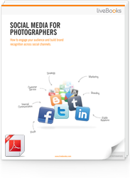
FREE EBOOK
Learn how to engage your audience and
build brand recognition across social
channels. Learn more...
READY TO GET STARTED?
Pick your package. Pick your design.
No credit card required.