
Resolve
A collaborative online community that brings together photographers and creative professionals of every kind to find ways to keep photography relevant, respected, and profitable.
Have an idea for a post?
Want us to find an answer to your question? Interested in becoming a contributor?Email us
CATEGORIES
- Aerial Photography
- Business
- Featured Blogger
- Featured Website
- Fine Art Photography
- Ideas
- Industry Events
- Inspirational Work
- Meet the Team
- Networking
- New Features to LB8
- On The Calendar
- Philanthropy
- Photography
- Adventure Photography
- Advertising Photography
- Animal Photography
- Art Photography
- Beauty Photography
- Celebrity Photography
- Commercial Photography
- Documentary Photography
- Editorial Photography
- Fashion Photography
- Food Photography
- Hospitality Photography
- Interior and Architecture Photography
- Landscape Photography
- Lifestyle Photography
- Nature Photography
- Photojournalism
- Portrait Photography
- Science Photography
- Space Photography
- Sports Photography
- Still Life Photography
- Travel Photography
- Wedding Photography
- Wildlife Photography
- Wine Photography
- Playlist
- Playlists
- Social Media
- Tuesday's Tip
- Video
- Webinar
- Website Tips
Posts Tagged: website tips

Ready to build your own website, but don’t know where to start? Start with a stylish website template! A template provides a foundation to work with when establishing your web presence and makes building and maintaining a site easier than starting from the ground up.
The complex task of building a website because easier once you pick out a goos starting point. Check out our tips for how to choose the best website template for your business.
1) Determine the Goal of Your Website
A business website can serve a variety of purposes:
- Growing your email list
- Gathering leads with free content
- Selling products and services
- Acting as a “virtual business card”
- Providing useful information to customers
Ask yourself what you want visitors to do when they arrive on your site. A good template combines a layout designed to fulfill this specific purpose with tools to make setup and maintenance as easy as possible.
The purpose of your site should be clear to your customers from the moment they click through from searches or ads. If your template doesn’t align with your goal, visitors are likely to be confused about what actions you want them to take.
2) Consider the Content
Your website content should guide you on your journey to picking out the right website layout. Look for templates with enough space to display a variety of content without crowding the screen or overwhelming customers with too much visual information per page.
Think about where and how you want to display:
- Text
- Images
- Blog posts
- Videos
- Calls-to-action
- Product descriptions, if applicable
Every page also must have room for the all-important business “NAP.” Short for name, address and phone number, this contact information should appear prominently in at least one universal spot so that visitors have no trouble getting in touch with you.
3) Look for Inspiration Everywhere
Think about the websites you enjoy visiting and those to which you keep going back. What aspects of the layout, colors, navigation and other elements attract you? What did the site designers do to make the experience so enjoyable?
Make a list of three to five websites with features you’d like to mirror on your own site. Write down why they appeal to you and which elements you want to see in a template. This gives you a starting point when looking for layouts and can help you weed out templates with too few or too many features.
If you can’t find a template with the right combination of design and usability, take your notes to a designer. Professionals have the skills to bring together all the elements you want in a realization of your vision for your site.
4) Check the Level of Customization
When thinking about how to choose a website template, the amount of customization you can perform is important. Consistent branding plays a key role in customer acquisition and retention, so a template must offer the ability to change theme colors and add images such as logos and product photos.
However, it can be a hassle if a template requires too many changes to meet your needs. Look for layouts with easy tools, including drag and drop editing, grid layouts and one-click adding of common page elements. These are important options if you’re unfamiliar with code but still want to design an attractive site.
5) Know How Your Audience Browses
Responsive design is a must in modern website templates. The world has gone mobile, and chances are good the majority of your audience is searching, browsing and making purchase decisions using a smartphone or tablet. To accommodate this, a template should:
- Adapt to all screen sizes without compromising layout
- Provide flexible navigation
- Include mobile-friendly form options
Compatibility across browsers is another important feature regardless of what type of device is being used. Make sure the template you choose looks good and functions properly in Chrome, Firefox, Safari and other major browsers.
6) Design for Growth
Where do you picture yourself going in the coming years? Make sure you choose a template designed to grow along with you. A simple template without too many bells and whistles is an attractive choice when you’re just starting out, but it will cost you time in the long run if you have to upgrade in a few months or a year to accommodate changes. From color and design to navigation and expansion options, look for a template with the capability to meet your needs both today and several years from now.
7) Seek a Good Support Team
Professional templates should come with an easily accessible support system. This may include:
- Telephone support
- Email support
- FAQs
- Instructional videos
- Access to detailed documentation
- Direct support from the designer
- An open forum in which to ask questions
The more comprehensive the support system, the better. Good support is most important when you plan to do a lot of custom work on your site. If you make a mistake you don’t know how to correct, it can set you back hours or even days unless support is available to guide you in fixing the problem.
Template designers should also include announcements of updates and how to apply changes to your site. Be wary of designs without any recent updates. An old template may have unresolved security issues or lack the support you need to create a robust layout.
A well-designed website template helps you build your own website with ease and produces a professional finished product to attract and impress your target audience. By making the most of the tools provided with your chosen template, you maximize the customer experience and increase the likelihood of conversions. Templates level out the learning curve involved in website building and give you the power to update and change your website whenever you wish. View
Let’s get started!
Customize Your Website with These Cool Mobile Navigation Features
Posted by admin

At liveBooks, we’re proud to offer websites that are completely responsive and scale across all devices seamlessly. While these mobile-friendly features come standard on all our websites, we also want to give our customers the ability to easily edit the design on every version of their website. With our mobile navigation styling options, you have the power to easily change their website’s navigation structure across desktop and mobile devices. While other website building platforms may require an expensive developer for these types of mobile navigation changes, our user-friendly CMS lets even those with no coding experience take back the reins on their website management. Let’s take a look at some mobile navigation styling features that you can add to your website.
The Choice Is Yours
With 45 icons and over 130 style and shape variations to choose from, you’re sure to find an option that matches your unique brand’s website design. Once you have the perfect icon selected, easily change the icon color to match your branding via the color picker. You can also add a shape beneath your icon if you’d like, or leave it as is. Finally, adjust how large or small you want your icon to appear on mobile devices, and choose what side of the screen you want to place it on.
Click Action Design
Now that you’ve created the perfect icon, it’s time to determine how you want your mobile menu to appear to your website users. Choose how your mobile menu will behave on the click action by selecting between 3 reveal options (full screen, push content, or overlay content), 5 animation effects (stack, slide, fade, bounce, retreat or stack), and decide how your navigation menu is made visible to website users. You can even style your navigation menu text, and design how sub-navigation pages will appear on the mobile navigation.
See It In Action
Try it on your current liveBooks website now, and visit our support library for step-by-step instructions that will show you exactly how to design your mobile navigation. Not a liveBooks customer? Start your 14-day free trial today, and see how easy creating a beautiful mobile website can be.
Spice Up Your Website with Carousel Slideshows and Parallax Scrolling
Posted by admin
Who says websites have to be plain? liveBooks offers a rich selection of design options to make your website stand out from the crowd. You don’t have to re-work your entire site to add some visual excitement. Carousel slideshows and parallax scrolling are just two features that can give your website a fun, modern aesthetic.
Carousel Slideshow Layout
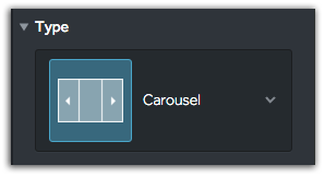
Our customers love to make their pages look amazing! Looking for a fun new way to display images? Check out the Carousel slideshow, one of our 8 image gallery layout types we have for you to choose from. Watch your images smoothly shift along a horizontal path with the Carousel slideshow.
Parallax Scrolling
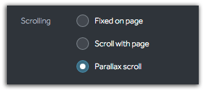
Choose a high definition background image of your choice and turn on Parallax scrolling for a dynamic effect. The background will glide below your floating content as you scroll up and down your webpages.
Drop Us a Line
If you are looking for a great new feature that liveBooks has yet to adopt, feel free to reach out and provide feedback! Keep your eye out on new features and updates we will be adding throughout the new year.

With so much of our online activity being done from our mobile phones, there’s no surprise that one in two people will not recommend a business with a poorly designed website. We’ve stressed on the importance of having a mobile-responsive website in one of our articles, so if your website still behaves the same wherever you access it from, we’re here to give yet another incentive as to why you should switch: the footer.
FREE EBOOK
Learn how to engage your audience and
build brand recognition across social
channels. Learn more...
READY TO GET STARTED?
Pick your package. Pick your design.
No credit card required.