
Resolve
A collaborative online community that brings together photographers and creative professionals of every kind to find ways to keep photography relevant, respected, and profitable.
Have an idea for a post?
Want us to find an answer to your question? Interested in becoming a contributor?Email us
CATEGORIES
- Aerial Photography
- Business
- Featured Blogger
- Featured Website
- Fine Art Photography
- Ideas
- Industry Events
- Inspirational Work
- Meet the Team
- Networking
- New Features to LB8
- On The Calendar
- Philanthropy
- Photography
- Adventure Photography
- Advertising Photography
- Animal Photography
- Art Photography
- Beauty Photography
- Celebrity Photography
- Commercial Photography
- Documentary Photography
- Editorial Photography
- Fashion Photography
- Food Photography
- Hospitality Photography
- Interior and Architecture Photography
- Landscape Photography
- Lifestyle Photography
- Nature Photography
- Photojournalism
- Portrait Photography
- Science Photography
- Space Photography
- Sports Photography
- Still Life Photography
- Travel Photography
- Wedding Photography
- Wildlife Photography
- Wine Photography
- Playlist
- Playlists
- Social Media
- Tuesday's Tip
- Video
- Webinar
- Website Tips
Photographer and world traveler Karl Nielsen develops dynamic images that showcase his high energy and fearless approach to photography – and his website exhibits all those same qualities.
We are really excited to have him as our featured website this week – read on to find out more about his site and see more at: www.karlnielsenphotography.com.

Q: How would you describe the aesthetic of your website in three words?
KN: Personal, Eclectic, Rough and Tumble.

Q: How do you choose the photos that you display on your homepage?
KN: I struggle with this all the time, portfolio consultants always tell me I should focus my portfolio in one genre. But in all honesty I have a broad set of interests and I really feel passionate about most of the projects I take on, which is good because when I started my business in 2007/2008 the economy was horrible and I was desperate to find any kind of work as long as it paid money. So from the beginning I was delving into every subject and genre I could all at once. Luckily, all of my clients have stuck with me and each client has introduced me to more clients and through word-of-mouth my business has grown in all sorts of directions. Because the type of work I do is so diverse so is my portfolio, which makes it difficult to decide what to show in it.
I guess the simple rules I stick with are as follows:
1) Strongest work
2) Most recent work
3) The type of work I want to do more of
4) Consistent galleries within the portfolio.
After I follow the listed guidelines it’s a lot of trial and error, adding photos, removing photos, and moving photos around until the portfolio has a good feel. My website never really feels finished to me, just constantly evolving.

Q: How often do you update your website?
KN: Probably every 2-3 months or whenever I build a new body of work that I want to show off to the world. It’s a good feeling when you are working on a project and you know you shot something better than anything else in your portfolio.

Q: What is your favorite feature that liveBooks offers?
KN: The scaling features and the mobile-friendly version of the site. It’s nice to be able to pull up my website on my phone while I’m talking to someone.

Q: What’s one piece of advice you’d offer to someone designing their website?
KN: A great website does not happen overnight, keep working on it.

Follow Karl’s adventures and see more of his awesome photos on Instagram – @kidcalifornia.
Have a website you’ d like us to feature? Email us at social@livebooks.com.
Robin Layton, an award-winning photojournalist, renowned artist, and filmmaker is our featured website this week. We just love the clean, fresh look of her site and how gracefully it pulls the user in, making them want to stay for hours!
Check out the full site here – www.robinlayton.com – and don’t forget to read below to see what she has to say about her site’s creation!

Q: How would you describe the aesthetic of your website in three words?
RL: Art, Fresh, Clean

Q: How do you choose the photos that you display on your homepage?
RL: I choose the ones in each category that I feel are the strongest ones, the ones that will hopefully get someone’s attention and make them want to look at that portfolio.

Q: How often do you update your website?
RL: It depends; I try and add new images when I shoot them. But overall, I try to update my website once or twice a year.

Q: What is your favorite feature that liveBooks offers?
RL: That you can easily edit or update your images/content yourself and that it’s so simple to use!

Q: What’s one piece of advice you’d offer to someone designing their website?
RL: Design your website to reflect who YOU are. Make it different than everyone else’s. Once of my favorite quotes: “Be yourself, everyone else is already taken.” – Oscar Wilde.

Have a website you’d like us to feature? Email us at social@livebooks.com.
Manuela Marin Salcedo is a research and development team member and content developer at Momenta Workshops. Her expertise is in visual communications and social media. In addition to her work for Momenta, Manuela is working on long-term, independent multimedia projects. Her work has been featured at LookBetween 2014, Fototazo, and Light Work. She was also chosen to participate in the 2014 New York Times Portfolio Review.
Working with nonprofits provides the opportunity to produce important imagery that can spark global dialogue. The experience can be both rewarding and fulfilling for visual creators. However, many photographers fail to price appropriately (or even at all) for their services.
I have worked with the team at Momenta Workshops to put together a basic list of top tips to consider when beginning your exploration of the nonprofit photography marketplace.

The James House Organization provides community-based child and youth care development programs in Hout Bay, South Africa. Photo © Lukas Spieker/Momenta Workshops 2015.
1. Know if a nonprofit can afford you
Nonprofits who value good imagery will understand strong visuals have an immediate impact on their donors. Before meeting with a client, you’ll need to do your research and see if the group has the budget to afford you. Chances are if they have a staff of more than 10 people, a nice office, and big donations coming from corporations… they can afford you. So negotiate reasonably, and find a way to make their budget work for their needs.
2. Understand their visual needs
Congratulations! They’ve hired you. Now, you’ll want to be clear on their visual needs and desires before you go out on the shoot. What kinds of issues is this nonprofit grappling with? What images do they tend to use most often? Do they want single image or a photo story? These are all questions you’ll need answers to before you begin photographing.
3. Be clear about your deliverables
Before going into the field, you will also want to be clear about what they can expect from you in terms of deliverables. For example, there is no need to provide them with the RAW images, especially if they do not have the software to process them. So, be upfront if you’re only handing over jpegs. Additionally, be clear about how long they are allowed to use the imagery, and get it in writing. Then, set a reminder on your calendar on the day their use expires. This way, you can reach out to see if they’d like to renew their contract or even hire you to produce new imagery.
4. Be honest with your imagery
Though you are taking what may be considered promotional imagery for marketing purposes, remember nonprofits deal with issues rooted in reality, and their audience will appreciate the real moments you document. For example, anybody that has photographed a group of schoolchildren before knows that things are not fine and dandy at all times. Smiles can turn into frowns in an instant. But explain to the client that these situations provide the opportunity for a volunteer to hug or comfort the upset child, and you’ll want to capture that gesture.
5. Don’t forget to follow up
Follow through is key to making lasting clients. Ask the client what they liked and what they didn’t like from your shoot. Take criticism constructively, and work on that during the next shoot. Follow up with them in 1-2 months to see how the images are working for them and ask if they need more work done during the coming months, the holidays, special events, etc. Keeping in touch with clients will help put yourself above the rest of the pack and keep you valuable to them for their imagery needs!
If you’re interested in going into more detail about these topics, Momenta offers 10% off to all liveBooks members for our workshops, including the one-day The Business of Nonprofit Photography seminars as well as our longer Working with Nonprofits series with Leica Camera. Simply use the discount code LIVEBOOKS. You can learn more about our nonprofit business skills workshops here.
Gary Kordan – an extremely talented Art Director and Production Designer for television – has a website unlike any we’ve ever seen before. His utilization of graphics, video, and imagery keeps users supremely engaged and wanting to click to each new section.
We are honored for his site to be our featured website this week – so read on because you’re in for a treat!

Q: How would you describe the aesthetic of your website in three words?
GK: Dynamic, Bold, Edgy

Q: How do you choose the photos/videos that display on your homepage?
GK: As a production designer for television, I try to choose my most recent recognizable project to display on my homepage. A big, bright set design featuring well-known talent like Key & Peele or the cast of Workaholics helps potential clients to get excited about my work. Finding the right image that showcases set design, set decoration, and overall aesthetic of the TV show I designed is important because my website audience is extremely busy and may only spend 30 seconds on a site. First impressions are important!

Q: How often do you update your website?
GK: I update the order of my galleries and blog often. Especially when I’m up for a show that is searching for a specific type of look. If the project is a single camera comedy I’ll feature these images first. If it’s a variety or sketch show, I’ll move those to the beginning of the gallery. Same with the most recent blog post. I am always assuming that people have only 15 seconds to look at my site and blog so I don’t want to bury the stuff I think they want to see. I’m pretty sure all television producers have ADD. One recent exception to this happened when I booked a show after a great meeting (in Hollywood interviews are “meetings”) and the star of the show said that my website was the best she had ever seen. She spent an hour on it reading and looking at everything!

Q: What is your favorite feature that liveBooks offers?
GK: My favorite feature is my video homepage that changes each time it’s refreshed. I have black and white video edited to look like silent movies. To me it serves as a premium and warm-up to the full color and bold images in the galleries. Black is my favorite color and very much a part of my brand. The look of my site and the homepage video preview has an edge that matches my daily wardrobe.

Q: What’s one piece of advice you’d offer to someone who is designing their website?
GK: My best advice to someone designing their website is to ask someone to objectively be their editor. Are there too many photos? Are the names of the galleries too confusing? Typos in the bio? Is their homepage too busy to navigate? I feel like less is more and no one really cares about a project from 20 years ago unless it’s in a specifically named gallery. Ask a friend or a family member to look at the website before it launches. Sit beside them and notice if they start to get bored or if the images seen redundant. A website should play like a great movie or rock concert. It should draw people in and leave them wanting more. The minute they are confused by the navigation or losing interest in the photographs it’s time for an edit!

Head on over to www.garykordan.com to see more (our post really doesn’t do his site justice!)
Have a website that you’d like us to feature? Email us at social@livebooks.com.
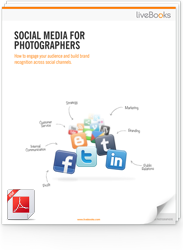
FREE EBOOK
Learn how to engage your audience and
build brand recognition across social
channels. Learn more...
READY TO GET STARTED?
Pick your package. Pick your design.
No credit card required.