
Resolve
A collaborative online community that brings together photographers and creative professionals of every kind to find ways to keep photography relevant, respected, and profitable.
Have an idea for a post?
Want us to find an answer to your question? Interested in becoming a contributor?Email us
CATEGORIES
- Aerial Photography
- Business
- Featured Blogger
- Featured Website
- Fine Art Photography
- Ideas
- Industry Events
- Inspirational Work
- Meet the Team
- Networking
- New Features to LB8
- On The Calendar
- Philanthropy
- Photography
- Adventure Photography
- Advertising Photography
- Animal Photography
- Art Photography
- Beauty Photography
- Celebrity Photography
- Commercial Photography
- Documentary Photography
- Editorial Photography
- Fashion Photography
- Food Photography
- Hospitality Photography
- Interior and Architecture Photography
- Landscape Photography
- Lifestyle Photography
- Nature Photography
- Photojournalism
- Portrait Photography
- Science Photography
- Space Photography
- Sports Photography
- Still Life Photography
- Travel Photography
- Wedding Photography
- Wildlife Photography
- Wine Photography
- Playlist
- Playlists
- Social Media
- Tuesday's Tip
- Video
- Webinar
- Website Tips
Kyle Froman started off as a dancer for America’s premier ballet company and has transitioned into one of the country’s best-known dance photographers. His entire website design exudes grace and elegance, clearly depicting the style in which he photographs. We couldn’t wait to feature his website this week!
Don’t forget to head on over to www.kylefromanphotography.com to see more!

Q: How would you describe the aesthetic of your website in three words?
KF: Clean, Elegant, Dramatic

Q: How do you choose the photos that you display on your homepage?
KF: Since the homepage of my website is a grid display, I chose an overhead photo of New York City Ballet dancers laying on the marble floor of their Lincoln Center Theater. The floor has a grid pattern too, and I thought it worked well together. There was also a good amount of negative space in the image to show off the portfolio key images in the grid.

Q: How often do you update your website?
KF: I update my website usually once a month. Sometimes when I haven’t looked at it for awhile I’ll go through the entire site and see what could be improved, what could look better, but also what stands out as good!

Q: What is your favorite feature that liveBooks offers?
KF: My favorite feature in my liveBooks website is the editSuite. I like how easy it is to change content whenever I want. It’s simple to keep everything up to date.

Q: What’s one piece of advice you’d offer to someone designing their website?
KF: My advice to someone designing their website is to keep their design simple. Whittle down your shots to the best, and leave the viewer wanting more.

Have a website you’d like us to feature? Email us at social@livebooks.com.
Beyond The Deadline – Shooting Arizona State University Football’s Ad Campaign
Posted by liveBooksGuest post by liveBooks client Blair Bunting. Original post found here.
There are deadlines and then there are deadlines…this is the latter.
ASU’s advertising campaign is one that I have now shot for 10 years. It is one that I always use to push logistical boundaries that I had previously been inflexible towards, for the sake of art and knowledge. Photographing it is a practice in embracing the unknown and evaluating previously conceived notions of what is possible and what is not.
This year’s photoshoot existed well within the impossible…

For example, I usually shoot the ASU campaign the last week of May and deliver the images on deadline…August 1st. This way the designers at ASU can create layouts and posters, billboards and ticket stubs and all that’s in between in the two weeks before press deadline (August 14th).
However, this year was different, for ASU was in the midst of changing from Nike uniforms to Adidas. We knew going into April that this shoot could be a bit tighter on the deadline than usual. As May began, I already had laid out the images for the campaign and had my crew on stand-by on a moments notice if we needed to be at the studio. However, the new uniforms were not ready and so we found ourselves waiting…and then came June…and then went June.

It was looking like an impossible deadline at this point, for where I normally have 60 days for production, I would now have half.
AND THEN WENT JULY.
There comes a moment, at which one must release true control of a situation, and this was it. Any ideas that I had of a production schedule had to be let go. In a sense, if this campaign happened at all, it would be a very visceral knowledge of the process that would take over and one that only experience could teach.
August 1st: The deadline of the many campaigns of year’s past had arrived and passed. For me, it was a simple glass of scotch that evening and a comfort that only a purchase of a time machine (found on eBay) would make this one possible.
August 15th: The call saying that we would shoot in three days (yeah, August 18th), and we might be limited on jerseys for the guys to wear (oh the understatement). However, if there is one thing that I have learned about ASU, it is that their athletes are incredible and even the toughest challenges are easier with how much they help me out on set.

August 18th: The first day of the shoot had arrived and the crew that had been on standby for most of the summer for this one were ready. Even though we were months behind schedule, everyone was happy; for we knew what we had to do and knew that it could be a good time as well.
As the guys showed up to the studio, the wardrobe arrived as well. We had 10 athletes to photograph and one, yes ONE, pair of pants. Now we had that one pair in maroon and black, so technically that’s two. However, you may say, “Blair I thought ASU wears gold pants on occasion” and you would be correct.
Worry not, we had a pair of gold pants as well, with one minor caveat. You see, the only pair of Adidas football pants that existed in gold belonged to the ASU mascot, Sparky. For those of you who don’t know him, he is a devil that runs around the field and does push ups. The big issue is that Sparky has a tail. Some of you have figured out where this is going, and yes, the only pair of gold pants we had had a hole in the butt for his tail.

Remember, photoshoots will always make you stronger and more resourceful for the next one.
So we shot for two days on set and had the final images being delivered even when we showed up for day two. The reason it all happened is quite simple: incredible people. From crew to client to talent to retouching, everyone involved on this project didn’t worry about deadline, they just worried about doing their best and staying positive.
As much as being an advertising photographer is about being in control of a production, the true talent of one is measured when control is given up.
Do not miss the behind-the-scenes video, found here!
Boston-based photographer Winslow Townson has over 25 years of experience photographing news, sports, features, and stories. His journalism background shines through in each of his images and this week we wanted to feature the fantastic job he’s done designing his website.
Check out what he had to say about what went into his site’s design and then head on over to www.winslowtownson.com to view the full thing!

Q: How would you describe the aesthetic of your website in three words?
WT: Clean, Vibrant, Easy

Q: How do you choose the photos that you display on your homepage?
WT: Since most of my work is sports related, I do a slideshow of sports pictures based mainly on the sports of the current season and the sports on the seasons that are coming up soon.

Q: How often do you update your website?
WT: I do my best to update my website’s “Recent Work” page after every assignment so that I keep it fresh and clients can see what I’ve done lately. I do a very tight edit of the images with usually just one or two selections from each job.

Q: What is your favorite feature that liveBooks offers?
WT: Definitely the editSuite. It is so easy to change images quickly, rearrange categories and change the homepage slideshow. That is one of the things that attracted me to liveBooks – it’s so user-friendly!

Q: What’s one piece of advice you’d offer to someone designing their website?
WT: Make it user-friendly. That can mean many things from simple navigation, readily available contact information, and quick loading images to tightly editing your images so that there are not too many in any one category. It’s frustrating when you can’t easily figure out how to navigate through pictures and through the site. I heard one editor of a national magazine say that if a site takes too long to load or he can’t figure out how to look at specific images quickly he will just close out the site. When he would stay with a website he would spend a few minutes maximum to get a feel for the photographer. So the user needs to get to where they want to be quickly and easily and not have an overwhelming amount of content. Having contact information readily available is obviously an aspect of being user-friendly. I put all my contact information at the bottom of every page.

Have a website you’d like us to feature? Email us at social@livebooks.com.
Now that we’re back in the office and able to reflect on the amazing three days at Photo Plus Expo in New York City, we are reminded once again how truly awesome our clients are! We had an absolute blast meeting new people and catching up with old friends, chatting with you about your websites, and facilitating one-on-one Support help.
We scanned over 600 people at the liveBooks booth, gave out tons of swag including our signature orange tote bags, sunglasses, lens cloths, and stickers (hope you got some before we ran out!)

If you stopped by our booth hopefully you were able to check out some of the exciting new things that are coming to liveBooks in the next few months. If you didn’t get a chance to stop by or attend PPE – stay tuned for the big unveiling very soon!
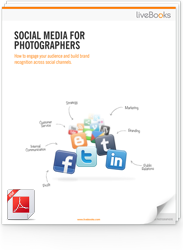
FREE EBOOK
Learn how to engage your audience and
build brand recognition across social
channels. Learn more...
READY TO GET STARTED?
Pick your package. Pick your design.
No credit card required.