
Resolve
A collaborative online community that brings together photographers and creative professionals of every kind to find ways to keep photography relevant, respected, and profitable.
Have an idea for a post?
Want us to find an answer to your question? Interested in becoming a contributor?Email us
CATEGORIES
- Aerial Photography
- Business
- Featured Blogger
- Featured Website
- Fine Art Photography
- Ideas
- Industry Events
- Inspirational Work
- Meet the Team
- Networking
- New Features to LB8
- On The Calendar
- Philanthropy
- Photography
- Adventure Photography
- Advertising Photography
- Animal Photography
- Art Photography
- Beauty Photography
- Celebrity Photography
- Commercial Photography
- Documentary Photography
- Editorial Photography
- Fashion Photography
- Food Photography
- Hospitality Photography
- Interior and Architecture Photography
- Landscape Photography
- Lifestyle Photography
- Nature Photography
- Photojournalism
- Portrait Photography
- Science Photography
- Space Photography
- Sports Photography
- Still Life Photography
- Travel Photography
- Wedding Photography
- Wildlife Photography
- Wine Photography
- Playlist
- Playlists
- Social Media
- Tuesday's Tip
- Video
- Webinar
- Website Tips
Websites
Todd Beltz, a commercial and editorial photographer who specializes in culinary, space, and travel images, has a website that is so colorful and eye-catching it seems to pop off the page – yet still manages to be extremely clean and easy to navigate.
Here’s what Todd had to say about his site – and don’t forget to head on over to www.toddbeltz.com to see more!

Q: How would you describe the aesthetic of your website in three words?
TB: Minimalist, easy, clean

Q: How do you choose the photos that you display on your homepage?
TB: Choosing photos to put up on my website is a tough job as a photographer. I may find a picture I took to have special meaning and want to display it but it won’t particularly hold any interest to the viewer. So I generally choose photos that will hopefully draw the viewer in to want to see more.

Q: How often do you update your website?
TB: This varies depending on my work schedule, but I do try to update it with new material at least twice a month.

Q: What is your favorite feature that liveBooks offers?
TB: I have a few favorites but if I had to pick one it would have to be the SEO that liveBooks offers.

Have a website that you’d like us to feature? Email us at social@livebooks.com!
Artist Claire Rosen, who specializes in fine art, as well as fashion and advertising photography, and was named in Forbes 30 Brightest Under 30 for Art and Design in 2012 and 2013, has one of the most unique yet easy-to-navigate sites we’ve ever seen.
Here’s what she had to say about it – and don’t forget to check out her photography, it’s absolutely stunning!
Q: How would you describe the aesthetic of your website in three words?
CR: Branded, Functional, Cohesive

Q: How do you choose the photos that you display on your homepage?
CR: The images selected for display on the homepage were chosen to reflect a cohesive vision in my work that didn’t draw lines between fine art or commissioned projects.

Q: How often do you update your website?
CR: I update my website as I have new projects or information to share.

Q: What is your favorite feature that liveBooks offers?
CR: That it is so easy to use and update that I don’t ever have to worry about it!

Check out Claire’s full site: www.claire-rosen.com and follow her adventures on Instagram: @clairerosenphoto.
Have a website that you’d like us to feature? Email us at social@livebooks.com!
For the second installment of our featured website of the week we have Martin Sundberg, a photographer, director, and DP based in the San Francisco Bay area. He specializes in making photographs and films of people living an active life and pursuing their passions by land and by sea.
Check out what he had to say about his liveBooks site!
Q: How would you describe the aesthetic of your website in three words?
MS: Clean, functional, and eye-catching

Q: How do you choose the photos that you display on your homepage?
MS: Initially I worked with a consultant to edit galleries and categories. Since then I have added and subtracted as I saw fit (which does not always make a gallery stronger) but it is so easy to play with and always exciting to get new work up.

Q: How often do you update your website?
MS: After ever shoot I like to drop my favorites into a “new work” category, and if they easily fit in the flow of one of my other galleries I’ll drop them in there as well. As bodies of work present themselves I will just try them out in new galleries.

Q: What is your favorite feature that liveBooks offers?
MS: The behind-the-scenes. Making new galleries and adding new images is so intuitive.

Check out more of Martin’s site here: www.martinsundberg.com.
Have a website you’d like us to feature? Email us at social@livebooks.com!
You know the saying “you never get a second chance to make a first impression?” Well that absolutely applies to your website. Which is why your homepage – the first page people land on – is one of the most important pages on your entire website. We’ve identified five traits that make for a fantastic website homepage. How many of them does your site have?
1. Clearly Answers Who You Are and What You Do
As photographers and creative professionals, visuals are going to play a huge role in your website homepage. Ensuring that you choose a photo or photos that clearly illustrate who you are and what your brand is about is imperative so that the user continues to browse your site. Do you do multiple types of photography? Or specialize in one area? Make sure the visuals you choose reflect exactly what you do and what you can offer to a potential client. You never want someone to land on your site and have to ask “what do they do?”
2. Dynamic and Always Changing
Users are smart. They can tell when a site hasn’t been updated in a while or if the content is old. It’s important that your homepage reflects that you are constantly completing fantastic new work and projects and posting it accordingly. In this day and age, styles, techniques, even gear changes so rapidly that it is extremely important to showcase that you are “with the times” in the types of photos you display.
3. Stellar Visuals
As photographers this is where you have a huge leg-up over pretty much every other industry. You take stunning visuals for a living! But how do you choose just one (or a few) for a homepage? One way is to let your ideal consumer or customer decide. Your idea of your best picture may be totally different from your target audience, so feeling out public opinion can sometimes make the decision a lot easier. Maybe run a poll on Facebook or Instagram between two photos and see which one gets the most likes. Another idea is to ask some close friends/family what three words come to mind when they land on your homepage – if those three words are in-line with your style and what you envision your brand to be, you know you’ve got the right picture. Plus, as mentioned in number two, your photo should always be changing, so you will have plenty of opportunity to show off your different shots.
4. Optimal for All Devices
These days, mobile phones and tablets are quickly becoming the preferred way to browse the web. To make sure that people coming to your site have the best experience possible, it is very important that your website is optimized for mobile devices. Not only should your site display beautifully on mobile, but it should also be easy to navigate so your consumer is able to get all of the important information they need. Make sure to enable Mobile 2.0 in your editSuite!
5. Clear Navigation
When a user lands on your homepage, what is the logical next thing you want them to do? Most likely check out your portfolios, then maybe read your bio or get more info on you, and last but certainly not least, contact you. Make sure that your navigation portrays these steps in a way that a user would look for them. Make it clear what each page of your site displays so that they don’t have to waste any time looking for what they want or need.
What are some other traits that you think are the most important to keep in mind when designing your website? We’d love to hear your thoughts!
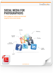
FREE EBOOK
Learn how to engage your audience and
build brand recognition across social
channels. Learn more...
READY TO GET STARTED?
Pick your package. Pick your design.
No credit card required.