 livebooks blog
Resolve
A collaborative online community that brings together photographers and creative professionals of every kind to find ways to keep photography relevant, respected, and profitable.
Have an idea for a post?
Want us to find an answer to your question? Interested in becoming a contributor?Email us
CATEGORIES
- Aerial Photography
- Business
- Featured Blogger
- Featured Website
- Fine Art Photography
- Ideas
- Industry Events
- Inspirational Work
- Meet the Team
- Networking
- New Features to LB8
- On The Calendar
- Philanthropy
- Photography
- Adventure Photography
- Advertising Photography
- Animal Photography
- Art Photography
- Beauty Photography
- Celebrity Photography
- Commercial Photography
- Documentary Photography
- Editorial Photography
- Fashion Photography
- Food Photography
- Hospitality Photography
- Interior and Architecture Photography
- Landscape Photography
- Lifestyle Photography
- Nature Photography
- Photojournalism
- Portrait Photography
- Science Photography
- Space Photography
- Sports Photography
- Still Life Photography
- Travel Photography
- Wedding Photography
- Wildlife Photography
- Wine Photography
- Playlist
- Playlists
- Social Media
- Tuesday's Tip
- Video
- Webinar
- Website Tips

Rusty Bradford is a native Texan born and raised in west Texas. He moved to Santa Barbara, California to attend Brooks Institute of Photography where he acquired degrees in Advertising Photography & Industrial/Scientific Photography. Both gave him the knowledge to venture out into the world of advertising photography.
Rusty is an established Dallas photographer whose low-stress professional demeanor vividly contrasts to his edgy and explosive photographic style. Informed by his prolific experience with hundreds of photographers on countless locations around the country, Rusty has been able to cultivate a visual style that is uniquely his own. He specializes in product, food & drink photography.

2. How would you describe the aesthetic of your website in three words?
Clean, Simple, Functional.
3. How often do you typically update your website?
Typically twice a month I sit down and update photos or edit content to help maximize SEO capabilities.

4. How do you choose the photos that you display on your homepage?
I try to pick images that will capture the viewers attention fast. Know who your potential clients are and pick images that you feel with grab there attention and showcase your talents in those clients eyes.

5. What is your favorite new feature of liveBooks8?
Being able to maximize my SEO capabilities through the new admin interface is my favorite new feature. It has allowed my to greatly increase my index rankings thru google. This was crucial for me since more and more creatives seem to be finding talent this way.

6. What’s one piece of advice you’d offer to someone designing their website?
My one piece of advice for someone designing their website would be to start the process as soon as possible. There is always a learning curve and it takes a lot of trial and error to tweak the design to the exact way you want it. Be patient and try to have learn and absorb as much knowledge as you can from other people. Don’t be afraid to make mistakes at this point you will learn from them.
Check out more from Rusty’s website here.

Leave a reply
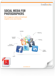
FREE EBOOK
Learn how to engage your audience and
build brand recognition across social
channels. Learn more...

READY TO GET STARTED?
Pick your package. Pick your design.
No credit card required.
