 livebooks blog
Resolve
A collaborative online community that brings together photographers and creative professionals of every kind to find ways to keep photography relevant, respected, and profitable.
Have an idea for a post?
Want us to find an answer to your question? Interested in becoming a contributor?Email us
CATEGORIES
- Aerial Photography
- Business
- Featured Blogger
- Featured Website
- Fine Art Photography
- Ideas
- Industry Events
- Inspirational Work
- Meet the Team
- Networking
- New Features to LB8
- On The Calendar
- Philanthropy
- Photography
- Adventure Photography
- Advertising Photography
- Animal Photography
- Art Photography
- Beauty Photography
- Celebrity Photography
- Commercial Photography
- Documentary Photography
- Editorial Photography
- Fashion Photography
- Food Photography
- Hospitality Photography
- Interior and Architecture Photography
- Landscape Photography
- Lifestyle Photography
- Nature Photography
- Photojournalism
- Portrait Photography
- Science Photography
- Space Photography
- Sports Photography
- Still Life Photography
- Travel Photography
- Wedding Photography
- Wildlife Photography
- Wine Photography
- Playlist
- Playlists
- Social Media
- Tuesday's Tip
- Video
- Webinar
- Website Tips


I started in photography 30 years ago. My introduction was casual through a friend. It continued with me taking weekend and nightly seminars while doing a full-time job in another field. I also combine photography with some of my greatest interests: culture, travel, and the welfare of women and children. After leaving my job in the corporate world 13 years ago, I decided to pursue my true passion, photography. I graduated from the Image Program of and Advertising School, The Creative Circus in Atlanta. For a while I did Commercial Photography work but migrated to my real love, documentary and social documentary work. Today I focus on creating photo stories on these topics…

Q: How would you describe the aesthetic of your website in three words?
LD: Color, Design, Visually Appealing.
Q: How often do you typically update your website?
LD: I update my website whenever I have new work that I want to share. Although my updated website is currently published, I am still combing through it to add/delete images & optimize the color & contrast and consistency in sizing…

Q: How do you choose the photos you display on your homepage?
LD: My homepage includes a mix of images that I am particularly fond of plus representation from my documentary stories.

Q: What is your favorite new feature of liveBooks8?
LD: I am truly enjoying the ability to have different layouts on my different pages. I think that it helps me to share my single images in the strongest possible presentation where I use a grid while presenting my documentary stories in a sequential manner with the edit that I perceive is the strongest.

Q: What’s one piece of advice you’d offer to someone designing their website?
LD: Pick a given size for your horizontal, vertical and square images and consistently apply the same size across your entire site. I am not certain if a Designer would agree with me but I perceive that this will help to create a stronger total presentation. Experiment with the different design options to learn what is most visually pleasing to you & complimentary to your work and intent.
Additionally, I am very excited to share my most recent Social Documentary story titles Becoming American (now re-titled New Americans on my website and published as a 13 image story in the Atlanta Journal Constitution, March 2017.

Have a website you’d like us to feature? Email us at social@livebooks.com.
Leave a reply
FREE EBOOK
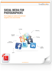
Learn how to engage your audience and
build brand recognition across social
channels. Learn more...

READY TO GET STARTED?
Pick your package. Pick your design.
No credit card required.
