
Resolve
A collaborative online community that brings together photographers and creative professionals of every kind to find ways to keep photography relevant, respected, and profitable.
Have an idea for a post?
Want us to find an answer to your question? Interested in becoming a contributor?Email us
CATEGORIES
- Aerial Photography
- Business
- Featured Blogger
- Featured Website
- Fine Art Photography
- Ideas
- Industry Events
- Inspirational Work
- Meet the Team
- Networking
- New Features to LB8
- On The Calendar
- Philanthropy
- Photography
- Adventure Photography
- Advertising Photography
- Animal Photography
- Art Photography
- Beauty Photography
- Celebrity Photography
- Commercial Photography
- Documentary Photography
- Editorial Photography
- Fashion Photography
- Food Photography
- Hospitality Photography
- Interior and Architecture Photography
- Landscape Photography
- Lifestyle Photography
- Nature Photography
- Photojournalism
- Portrait Photography
- Science Photography
- Space Photography
- Sports Photography
- Still Life Photography
- Travel Photography
- Wedding Photography
- Wildlife Photography
- Wine Photography
- Playlist
- Playlists
- Social Media
- Tuesday's Tip
- Video
- Webinar
- Website Tips

liveBooks offers many options for you to customize your site’s mobile navigation. With its standard settings, your site will come with mobile navigation style that matches your chosen theme. You will be able to customize options for navigation within the Design tool:

- Select Design from the Dashboard navigation bar.
- If not already selected, select the Sitewide tab on the righthand sidebar.
- Select Navigation

4. Select the Mobile tab to view your mobile navigation design settings.
5. Dropdown your icon options under the Layout dropdown menu. We give you 45 icons with over 130 icon style and shape variations to choose from, providing unique customization for you and your business’ brand. Select from the icons you see here.

6. Take a look below Layout and you will find all of your icon settings. Change how the icon looks and animates here:
(A) Icon – choose your icon color via presets or leave it without one.
(B) Shape – add a shape beneath your icon or leave it without one.
(C) Symbol Size – adjust how large or small you want your icon to appear.
(D) Icon Position – have your icon appear on the left or right side of your site.
(E) Style – have your navigation appear from above or slide in from the side of the screen.

(F) Reveal – select how the navigation reveals the menu items:
- Fullscreen – fill the entire screen with your navigation menu, on the click action.
- Push Content – choose this option to have your navigation menu push your content over, on the click action.
- Overlay Content – choose this option to have your navigation overlay on top of all your content, on the click action.

(G) Animation – 5 different animation effects

(H) Trigger – choose how your navigation menu is made visible:
- Label & icon – include the first navigation item’s title with your icon on the side, the styled expandable menu displays beneath.
- Icon only – show only the icon.
(I) Use mobile navigation on all devices – enable to display the mobile navigation in all viewports/devices. Currently available on two layout types: Top Navigation (Logo Above) and Top Navigation (Logo Below).

7. The Text panel adjusts default styling and font choices for all views of your navigation menu.
(J) Select your desired font and stylings for your navigation menu.

8. Within the Expandable Menus panel, design how the navigation menu appears on reveal.
(K) The design settings made here are for your navigation menu if you enable a navigation menu that appears on a click action.
(L) Sub-Navigation – choose “Always expand” to make all sub-navigation pages visible in the expanded menu. “Expand on click” makes an arrow appear and will require the customer to click the parent navigation item to view the child pages.
9. Select Save and Publish to make all of your navigation changes live now.
Leave a reply
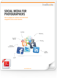
FREE EBOOK
Learn how to engage your audience and
build brand recognition across social
channels. Learn more...
READY TO GET STARTED?
Pick your package. Pick your design.
No credit card required.